How to build a CSS Mega Menu
Published at Oct 25, 2018
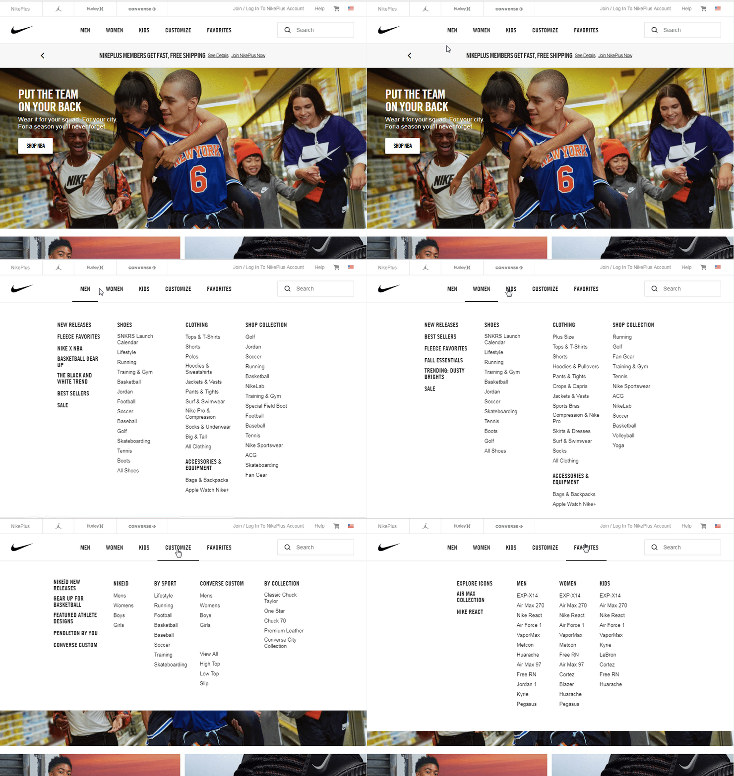
Megamenu’s are an essential frontend component found in many sites. From sites like bloomberg.com, nike, etc - these enhance the user experience so a user can find what they need quickly. Especially for sites hosting a lot of nested content, such as an ecommerce site. Example from Nike:

Navigating to one tab expands the a dropdown across the entire navbar. Essentially, it gives you another way of shopping. You could have clicked “mens” → “jordans” to find the newest release of air jordans. Or just move your mouse a bit and click the tab you want.
Megamenu’s save time for the end user, thereby increasing conversion rate. Nobody likes a site that takes forever to navigate, and a megamenu is one way to solve this.
So how do you build a megamenu using only CSS?
The question first is to break down how a responsive navigation bar works. Here is an example:
<div class="nav-wrapper container">
  <div class="nav">
    <div class="dropdown"><a>Category</a></div>
    <div class="dropdown"><a>Category</a></div>
    <div class="dropdown"><a>Category</a></div>
    <div class="dropdown"><a>Category</a></div>
    <div class="dropdown"><a>Category</a></div>
    <div class="dropdown"><a>Category</a></div>
    <div class="dropdown"><a>Category</a></div>
    <div class="dropdown"><a>Category</a></div>
  </div>
</div>
/* Global Base Styles and Resets */
* {
box-sizing: border-box;
}
body {
background-image: url(https://s3-us-west-2.amazonaws.com/s.cdpn.io/867725/black-wood-small.jpg);
color: white;
}
/* Bootstrap features for responsiveness */
.container {
margin: 0 auto;
width: 100%;
}
/* THE BASIC NAVBAR ONLY */
.nav-wrapper {
background-color: grey;
}
.nav {
display: flex;
justify-content: space-between;
text-align: center;
}
.dropdown {
width: 100%;
border-right: 1px solid black;
}
.dropdown:last-of-type {
border-right: none;
}
a {
color: white;
width: 100%;
display: block;
padding: 10px;
}Now modify and add the megamenu HTML portion. Do this by adding a <megamenu> class with two <p> children underneath. Add the following CSS, which controls the dropdown transition.
<div class="nav-wrapper container">
  <div class="nav">
    <div class="dropdown"><a>Category</a>
      <div class="megamenu">
        <p>hello</p>
        <p>world</p>
      </div>
    </div>
    <div class="dropdown"><a>Category</a>
      <div class="megamenu">
        <p>hello</p>
        <p>world</p>
      </div>
    </div>
    <div class="dropdown"><a>Category</a>
      <div class="megamenu">
        <p>hello</p>
        <p>world</p>
      </div>
    </div>
    <!-- repeat 5 more times -->
</div>
a {
transition: all 0.3s ease 0.15s;
}
a:hover {
background-color: red;
}
.nav {
position: relative;
/* This sets width of megamenu to 100% */
}
.megamenu {
position: absolute;
display: block;
width: 100%;
left: 0;
top: 39px;
opacity: 0;
visibility: hidden;
overflow: hidden;
background: red;
transition: all 0.3s ease 0.15s;
}
.dropdown:hover .megamenu {
opacity: 1;
visibility: visible;
overflow: visible;
}Try hovering over the text. It should show “hello world”
How it works is the following:
- When you hover over the nav item, it sets visibility to the menu
- The dropdown megamenu is positioned absolute, relative to the nav
- Transitions are applied both to the hovered item, and the megamenu that appears
You can make more complex menus than this. Here are other examples: